Standard Garden — Brand standards
The rules for the mark, its colour, its type and its motion. Short on purpose: a mark this simple only works if everyone draws it the same way.
The source of truth is the code. The mark lives in packages/icon/icons/stnd/ and apps/stnd.gd/modules/core/ui/LogoIcon.astro; the plugin draws the same geometry in apps/obsidian-standard-garden/src/brand.js. If this note and the code disagree, the code wins and this note is stale.

1. The idea
Four squares, two rows of two. Three readings, all intended:
asd ::error
- Rows in a garden. Beds, planted in order.
- The colon of
::. The Standard and the Garden, kept apart and held together by a membrane. The colon is the brand’s grammar: Standard::Garden. - State. The squares are also an indicator. A filled square is planted, an outlined one is not yet (section 5).
Square, sharp and equal, the way Helvetica draws its dots. No rounded corners, no gradients, no shadows, no outline around the whole mark.
2. Construction
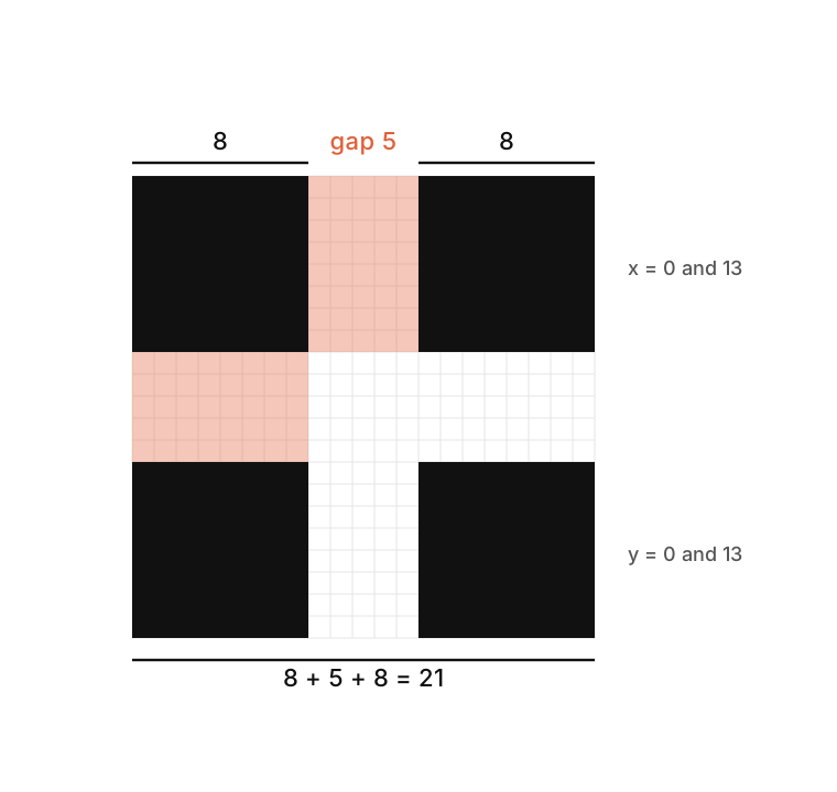
The proportions are Fibonacci, not eyeballed.
| Units | |
|---|---|
| Square | 8 |
| Gap between squares | 5 |
| Whole mark | 8 + 5 + 8 = 21 |
| Square origins | 0 and 13, on both axes |
The gap follows the size of the square: 5 : 8 is about 1 : 1.6, the golden ratio. If the mark is scaled, everything scales together. Never change the gap on its own to “fix” it at a small size.
The SVG viewBox is 0 0 21 21. Where a mark sits next to text (the wordmark, an app icon), the viewBox is padded to -1 -1 23 23 or -4 -4 29 29 so that the squares never touch the edge of their box.
<svg xmlns="http://www.w3.org/2000/svg" viewBox="0 0 21 21" fill="currentColor">
  <rect x="0"  y="0"  width="8" height="8"/>
  <rect x="13" y="0"  width="8" height="8"/>
  <rect x="0"  y="13" width="8" height="8"/>
  <rect x="13" y="13" width="8" height="8"/>
</svg>
3. Colour
The mark has no colour of its own. It is drawn in currentColor and takes the text colour around it: black on light, white on dark. That is what lets it belong to every theme and every gardener’s site.
- Favicon:
#000on light,#fffon dark (aprefers-color-schemerule insidefavicon.svg). - One colour at a time. Never two-tone, never one square in a different colour.
- Never on a busy photo without a plain field behind it.
Colour is allowed to carry state, and only there (next section). It always repeats what the shapes already say, so nothing relies on colour alone.
4. Clear space and size
- Clear space: keep at least one square (8 units) of empty room on every side.
- Minimum size: 12 px wide on screen. Below that the gap closes up; use the single-square glyph or leave the mark out.
- Beside text: the mark is set at the text’s own size (
1em, or1remin the header) and centred on the x-height, never larger than the line.
5. The state set
The same mark, six ways. Filled squares are planted, outlined squares are not yet. Reading order: top-left, top-right, bottom-left, bottom-right.
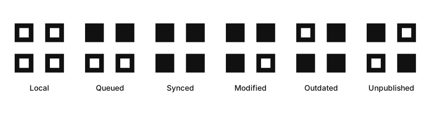
| State | Squares (TL TR BL BR) | Meaning | Colour token (Obsidian palette) |
|---|---|---|---|
| Local | ○ ○ ○ ○ | only in the vault | text-faint |
| Queued | ● ● ○ ○ | marked, goes at the next sync | yellow |
| Synced | ● ● ● ● | live, identical to the note | green |
| Modified | ● ● ● ○ | edited since publishing | blue |
| Outdated | ○ ● ● ● | the online copy is newer | orange |
| Unpublished | ● ○ ○ ● | switched off but still live | red |
Colours are never hard-coded: they come from the host’s own palette (--color-green, --color-blue, --color-yellow, --color-orange, --color-red), so they adapt to light and dark and to any theme. The states that ask the person to do something (Modified, Outdated, Unpublished) also get a small dot.
The outlined square is a 6 × 6 square with a 2-unit stroke, set 1 unit inside its box (so it occupies the same 8 × 8 footprint as a filled one).
6. The loader
The same four squares, planted one after another, clockwise: top-left, top-right, bottom-right, bottom-left, then cleared.
- Cycle: 1.2 s,
ease-in-out, infinite. - Each square starts 0.15 s after the one before.
- Opacity goes 0.2, up to 1 by 20 % of the cycle, held to 55 %, back to 0.2 at 80 %.
- With
prefers-reduced-motion, no animation: the four squares sit at 60 % opacity.
It replaces every spinner. In text it is sized in em (1.2 em) so it sits on the line.
7. The wordmark
Standard and Garden are two words around the mark (or the colon), set in two typefaces on purpose: one for the framework, one for the thing grown with it.
| Part | Typeface | Weight | Notes |
|---|---|---|---|
| Standard | Inter | 500 | capitalised |
| Garden | Kalice | regular | letter-spacing 0.03em |
Both are set at the same size, on the same baseline. The mark, when shown between the words, sits at the same size as the text.
It cannot ship in the open-source packages. Replacing it (and the other commercial fonts in @stnd/fonts) with an open-source face of the same feel is ticket T108. Until then the wordmark is correct only where Kalice is licensed.
A gardener’s own site may replace the Standard wordmark with their own brand (garden-brand): an image (drawn in the site’s foreground colour through a mask, at 1.5 × the header’s type scale) or a plain word. The Standard mark never appears on a personal domain’s content: it would be Standard Garden advertising on someone’s writing.
8. Share image
default.png, 1200 × 630. It is the card for Standard Garden’s own pages only (home, guide, pricing…). A note, a profile or a gardener’s own domain never gets it: they show their own picture, or none. Otherwise it would be Standard Garden advertising on someone else’s writing.
9. Don’ts
- No rounded corners, no rotation, no skew, no perspective.
- No change to the gap, the square size or the order of the animation.
- No colour on a single square, no gradient, no outline of the whole mark, no drop shadow.
- No stretching: it is always square.
- No fifth square, and no square removed: the empty and filled squares are a vocabulary, not a decoration.
- Don’t use the state patterns as a logo. The full, four-filled mark is the logo.
10. Files
| What | Where |
|---|---|
| The mark and its five states | packages/icon/icons/stnd/garden*.svg |
| Mark in the header | apps/stnd.gd/modules/core/ui/LogoIcon.astro |
| Loader | packages/icon/Loader.svelte |
| Plugin icons and loader | apps/obsidian-standard-garden/src/brand.js |
| Status vocabulary | apps/obsidian-standard-garden/src/features/publish-status/states.js |
| Favicon | apps/stnd.gd/public/favicon.svg |
| Share image | apps/stnd.gd/public/assets/img/default.png |
| Reveal app | apps/reveal/src/lib/icons.js |
Drawings of the mark, its construction and the states are in the Brand/ folder next to this note.